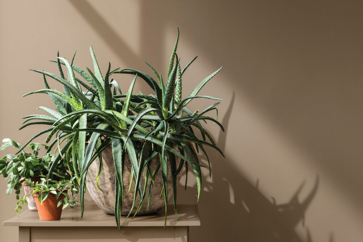
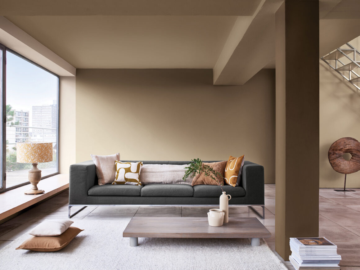
2021 Colour of the Year – Brave Ground
An earthy beige hue connects us to nature and brings a sense of warmth to our interior space
Experts identified the warm and grounding neutral shade as the colour that will enable people to draw upon the strength of nature to help them find the courage to embrace the future.
Adapting to its surroundings, Brave Ground also flexes in tone, depending on the time of day and setting, creating a subtly responsive environment that’s reflective of our growing desire to align how we live with our planet.
This year, driven by unexpected challenges, the world found comfort in the solidity of nature. By channelling this, experts believe Brave Ground will create a nurturing space that will encourage people to find the courage to express themselves, stand up for what they believe in and make new connections from the past to the future.
Marianne Shillingford, Creative Director, Dulux UK, says: “The colours on our walls are the backdrop to how we live our life. For many of us, lockdown has served to emphasise how important our home environment has become, it has been the place where we work, learn, relax. It can lift us up, nurture us, comfort us.”
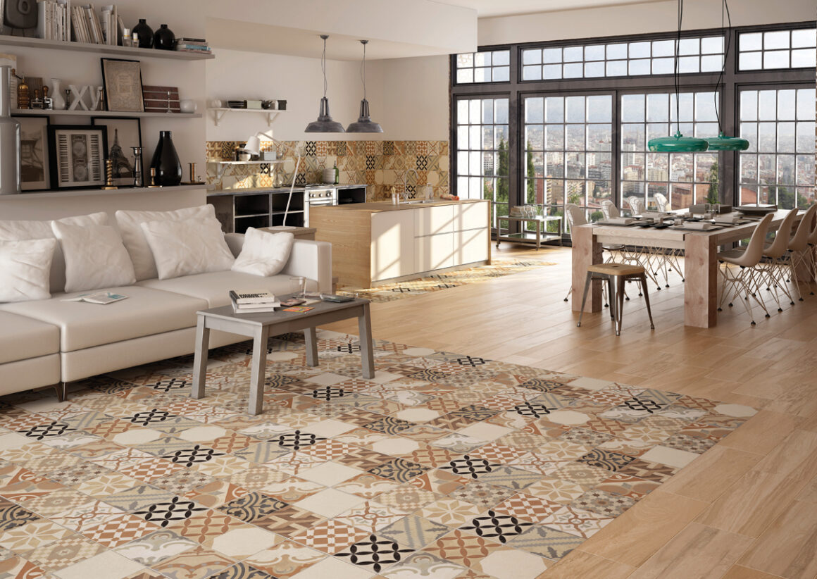
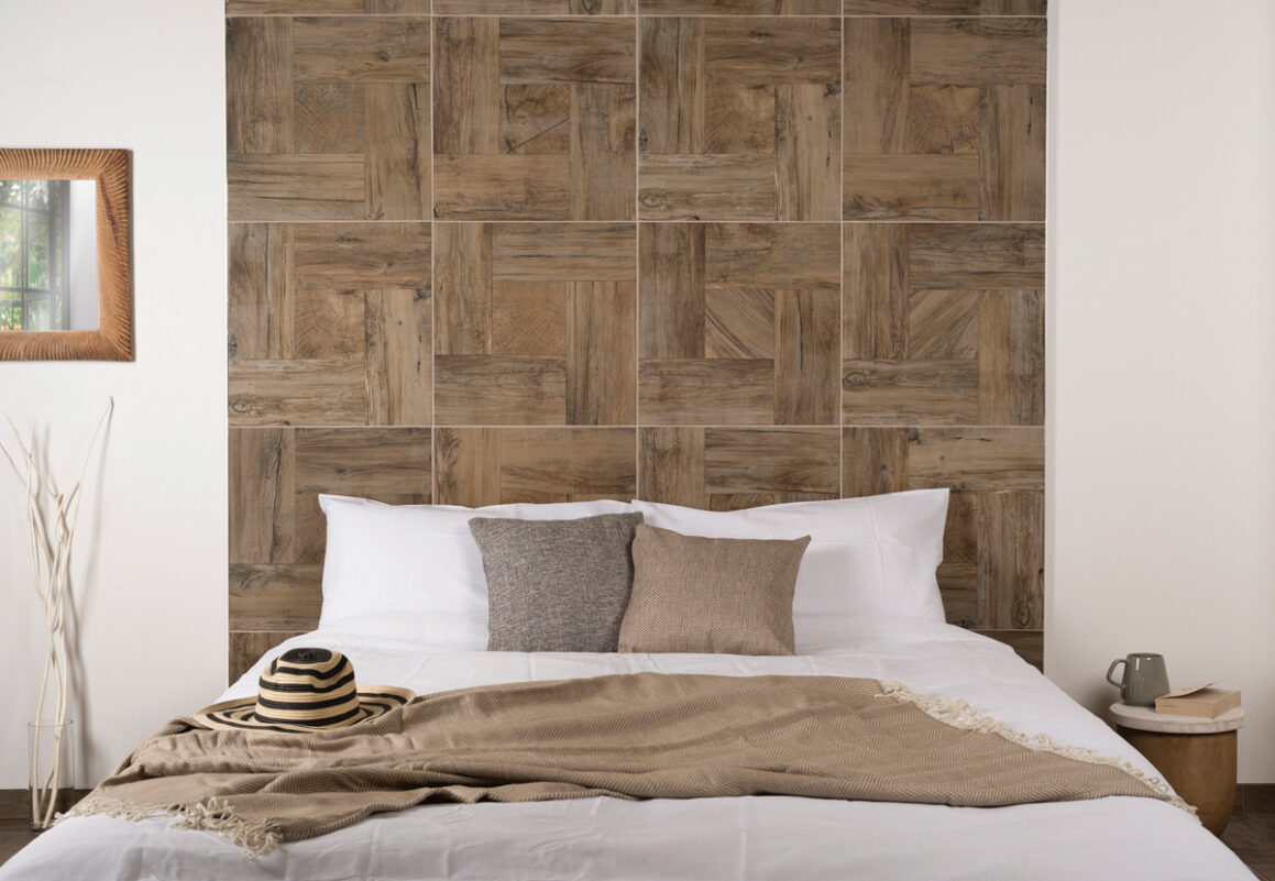
Kutlu Beige Mix Tiles
Invite a colourful medley of captivating Moroccan designs into your home with the addition of these Beige Mix Tiles. They consist of eye-catching Arabesque patterns, with a Stamford Tile design, and are perfect for bringing an interior area to life. Suitable for both walls and floors. There are 4 tile designs dispersed randomly, and each design contains 4 different patterns – totalling 16 different patterns.
Experts identified the warm and grounding neutral shade as the colour that will enable people to draw upon the strength of nature to help them find the courage to embrace the future.
Adapting to its surroundings, Brave Ground also flexes in tone, depending on the time of day and setting, creating a subtly responsive environment that’s reflective of our growing desire to align how we live with our planet.
This year, driven by unexpected challenges, the world found comfort in the solidity of nature. By channelling this, experts believe Brave Ground will create a nurturing space that will encourage people to find the courage to express themselves, stand up for what they believe in and make new connections from the past to the future.
Marianne Shillingford, Creative Director, Dulux UK, says: “The colours on our walls are the backdrop to how we live our life. For many of us, lockdown has served to emphasise how important our home environment has become, it has been the place where we work, learn, relax. It can lift us up, nurture us, comfort us.”
“We continue to live through uncertain times. In 2021, the warm and grounding tones of Brave Ground will allow us to find certainty in the strength from the very ground beneath our feet, emboldening us to go forward and begin to live again and giving us the flex to adapt to the ever changing circumstances we face.”
Alongside the Colour of the Year, the experts identified four complementary colour palettes to make it easy to bring the colour into different spaces within the home or workspace. These palettes – Earth, Trust, Timeless and Expressive – will help people create an environment where Brave Ground either stands strong or helps other colours to shine.
The Dulux Colour of the Year 2021 palettes:
THE EARTH PALETTE – Echoing the tones of the sea, the sky and the soil, these earth shades provide a connection to the natural world around us. Bringing the outside in, they are authentic and grounding colours that work naturally together.
THE TRUST PALETTE – Earth tones from across the globe, these unifying shades reflect everyone. Warm neutral greys and browns, these colours complement each other and encourage connection, collaboration and a sense of harmony in the home.
THE TIMELESS PALETTE – Inspiring shades of yellows and ochres, alongside soft neutrals, these are tones that can help create a backdrop that embraces old and new. Energizing without being overpowering, they bring positivity and balance to a space.
THE EXPRESSIVE PALETTE – Stand-out shades of reds and pinks, balanced with soft neutrals, these are colours that can add verve and vitality to our homes, allowing us to create an individual space that energizes, surprises and reflects who we really are.